Brand Standards
nfb.org/brandstandards
Updated March 2026
Overview
Our Purpose
Per our constitution, the purpose of the National Federation of the Blind is to serve as a vehicle for collective action by the blind of the nation; to function as a mechanism through which the blind and interested sighted persons can come together in local, state, and national meetings to plan and carry out programs to improve the quality of life for the blind; to provide a means of collective action for parents of blind children; to promote the vocational, cultural, and social advancement of the blind; to achieve the integration of the blind into society on a basis of equality with the sighted; and to take any other action which will improve the overall condition and standard of living of the blind.
Aspiration Statement
We imagine a world where blind people can live the lives they want as valued and respected members of society.
Mission Statement
We work tirelessly to improve the lives of blind people by fostering personal empowerment, coordinating nationwide advocacy, and building a network of collective achievement.
Our Brand Architecture
Our brand is made up of the ideas, values, characteristics, and qualities for which the National Federation of the Blind wants to be known. The brand architecture defines our brand. It is a reminder of our organizational values as we make decisions and take action. The brand architecture guided the creation of the one-minute model and the tagline, and it should also guide all of our other messaging. The components of the brand architecture are not necessarily intended to be used as external messages, but you may find that some of them can be. Some of our leaders find the brand promise to be a particularly powerful and resonant statement and use it in speeches, presentations, and documents. The elements of the brand architecture are as follows:
Tag Line
Live the life you want
Big Brand Idea
The most authentic voice in blindness
Brand Positioning
The National Federation of the Blind is the only organization directed by blind people that believes in our full capacity and has the power, diversity, determination, and love to transform our dreams into reality.
Brand Values
Believe in blind people
We believe in the capabilities of blind people; we take action to advance the aspirations of the blind; and we create a loving community where we learn to be our most powerful selves. Our faith in the capacity and dignity of blind individuals is at the heart of our mission.
Lead courageously
Our members and partners count on our expertise and our resolve. We will never shy away from the effort to surmount obstacles and raise expectations in pursuit of richer, fuller lives for all blind people. We have led this fight and made significant progress on the road to complete freedom and equality for the blind.
Champion collective action
We know we can’t do this work alone. The power of our membership acting through the democratic process, along with the support of our partners, enables us to engage in collective action with the expectation of self-determination and full participation in society by blind people.
Foster inclusion
We recognize the diverse strengths, talents, experiences, and perspectives of our members, staff, and friends; and we cultivate an environment that is welcoming and inclusive for all. We provide a loving, supportive, and encouraging community that shares in the challenges and triumphs of all blind people.
Dream big
We know that blindness need not hold you back. We want our community to feel empowered to dream big; and we’ll work with determination so those dreams can be realized. There are no limits to what we can accomplish.
Brand Personality
These are the distinguishing qualities and characteristics of the National Federation of the Blind. Personality attributes are key to the culture of the organization, both who you are and who you aspire to be.
Transformative
This personality trait is embodied by the ideas of:
Forward-thinking
Expert
Innovative
Sagacious
Motivating
This personality trait is embodied by the ideas of:
Encouraging
Courageous
Ambitious
Reliable
Powerful
This personality trait is embodied by the ideas of:
Bold
Driven
Leader
Influential
Inviting
This personality trait is embodied by the ideas of:
Warm
Inclusive
Collaborative
Loving
Brand Experience
I feel hopeful and motivated because of the love and encouragement within the National Federation of the Blind to grow and achieve my dreams while also contributing to advance our collective aspiration for all blind people to be valued and respected in society.
The Belief Message
The National Federation of the Blind advances the lives of its members and all blind people in the United States. We know that blindness is not the characteristic that defines you or your future. Every day we raise the expectations of blind people, because low expectations create obstacles between blind people and our dreams. Our collective power, determination, and diversity achieve the aspirations of all blind people.
One-Minute Model
Key messages should be a part of a library of talking and writing points you use in communicating with our target audiences. Think of our messages as the cornerstone of our written and verbal communications for years to come. Consistent, repetitive use of our key messages will greatly contribute to the ability of staff, board members, members, and other supporters to communicate effectively on behalf of the National Federation of the Blind.
Visual Identity
Visual identity is an important part of any brand. It can consist of your logo, your website, your printed materials, your office space, your employee attire or uniform, and the art on your walls. All these visual elements play an important role in communicating your brand to insiders and outsiders alike. Today, visual identity can be even more important due to unlimited opportunities for visuals on websites, social media, and videos.
If all National Federation of the Blind visuals share a cohesive look, it emphasizes the message that we are all part of one unified organization working together.
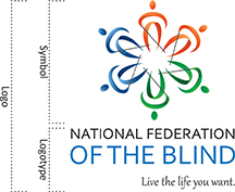
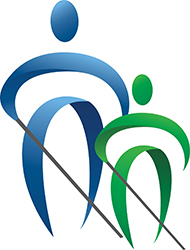
The logo of the National Federation of the Blind, which was redesigned in 2014, is a strong reflection of our organizational characteristics and values. The logo consists of three elements: a symbol and two text elements—our name and tagline.
The symbol features six identical “icons,” or stylized people holding canes in a circle. These icons are updated, contemporary version of our previous “Whozit” icon. They are displayed united in a circle and convey a feeling of moving together as one. This represents our key values of collective action, full participation, love, and democracy.
Each individual icon faces forward conveying action and inviting the viewer to engage. It commands respect and is more inviting than an icon facing to the side. By representing action, movement, freedom, and warmth, the icon represents our brand.
Together, the six icons convey the personality of the NFB—inspirational, innovative, powerful, and inviting. They demonstrate we are not alone; we are a group, a team, a family, working together.
The colors (blue, orange, green) represent optimism, love, unity, hope, confidence, growth, and energy—all of which are important to our brand. The variation of colors also reminds us that we are a diverse organization and each of us has something to contribute.
The font of the text is san serif, which is clean and more readable for those with low vision. The logo places more emphasis on the words “of the blind” in order to call attention to that important and powerful aspect of our organization. The tagline font is italic to imply the energy and action we want people to take in order to “Live the life you want.” The text in the logo represents power and action.
By each affiliate, chapter, and division consistently using the same logo and design elements across the entire organization, we build a strong, national brand and minimize confusion about who we are.
Our Logo
Our logo is a critical part of our brand and visual identity. To build a unified brand, it must be used consistently across our organization. To make this easier, we have outlined the details of how it should be used here.

The National Federation of the Blind logo is made up of a symbol and logotype that are to always appear together in proportion. If the logo is enlarged or reduced, it should always be treated as one unit and sized proportionately.
“National Federation of the Blind” is typeset in Corbel.
“Live the life you want.” is typeset in Gabriola.
Logo Variations
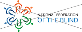
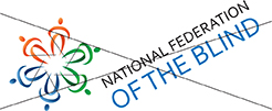
There are two approved versions of our logo: rectangle and square. Any other variations are not to be created or used.
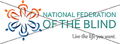
When space is limited is it acceptable to use the logo without the tagline: Live the life you want.
Logo: Clear Space
In order to make our logo clearly visible in all applications, we have set a “clear space” area where no text or graphics should appear. This will ensure our logo is visible and legible in all applications.
The clear space around the logo is equal to the height of the text "OF THE BLIND".
![]()
![]()
![]()
Logo: Misuses
Do not stretch or distort the logo.
![]()
Do not scale the elements separately.
Do not change the position of the elements.
Do not change the colors of the logo.
Logo: Color Format
Logo Colors
Our full color logo contains gradients. This means the main colors, blue, green, and orange are a blend of different shades of those colors. This gives us a few shades of each color to use as primary colors.
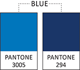
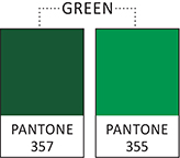
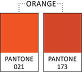
Color Codes (HEX)
Light blue: #0076BB
Dark blue: #002E6D
Orange: #D2451E
Dark green: #1A5632
Light green: #00953B
Full Color
Below is the approved color logo for use on light-colored or white backgrounds. The words National Federation should always be in black. The words "OF THE BLIND" should always be in Pantone 3005 or #0076BB.
![]()
![]()
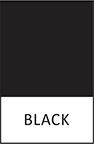
One Color
When color printing is not an option, the logo should ideally only appear in 100% black in either the rectangle or square format.

![]()
White Reversed
A white reversed-out version of the logo may be used when the background is dark and the full color logo does not show up well. This logo will show up in white and the background color will show up as-is, not black.
![]()
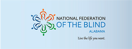
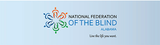
Affiliate Logo
The affiliate logo consists of the national logo with the addition of the state name in all caps, right aligned, between the words "OF THE BLIND" and our tagline live the life you want. These have been created for all affiliates. Contact [email protected] if you need the files.
Below are examples for the National Federation of the Blind of Alabama:
Chapter Logos
There are two layout options for both configurations (square and rectangle) of the chapter logo. The rectangle configuration options consist of the affiliate logo with the addition of the chapter name either in an arc or in a straight line above the words National Federation. The square configuration options consist of the affiliate logo with the addition of the chapter name either in an arc over the symbol or in a straight line below the words LIve the life you want. These can be created for all chapters. Contact [email protected] if you need your logo.
Below are examples for the National Federation of the Blind of Massachusetts, Springfield Chapter and the National Federation of the Blind of South Carolina, Anderson Chapter:
Division Logos
The division logos consist of the national logo with the addition of the division name in all caps, right aligned, between the words OF THE BLIND and our tagline live the life you want.
Below are examples for the National Federation of the Blind National Organization of Parents of Blind Children division logos:
State Division Logos
The state division logos consist of the national logo with the addition of the state division name in all caps, right aligned, between the words OF THE BLIND and our tagline live the life you want.
Below are examples for the National Federation of the Blind Maryland Association of Blind Merchants division logos:
Contact Suzanne Shaffer Schildwachter at [email protected] or (410) 659-9314, extension 2264 for all logo files. Different file formats are available including JPG or EPS (vector). If you are working with a printing company the EPS file is the best file to share with them as well as a copy of this brand standards guide.
Our Icons
Our symbol is made up of 6 colored icons. We do not recommend using this symbol without the name of our organization as that is our full logo. However, you may use one of the icons by themselves.
Icon Variations
Some simple variations can be made or added to our icon. For instance, a mortar board can be added for use by the students division. These files can be created by the national office art department when approved. Contact [email protected] if you need a file or have an idea.
OTHER VARIATIONS
When appropriate, for instance for the parents division, the icons can be used in simple groupings to simulate a family or parent and child.

Websites
All division, affiliate, and chapter websites should follow these branding guidelines. Please use these logos and colors. If you have an existing website, we can assist you with prioritizing and executing these updates when appropriate. Please contact [email protected] with any questions or to discuss further.
Social Media Imagery
Most social media sites (Facebook, Twitter, etc.) have two main image areas: A small image and a larger image. The small image should be one of our icons; any of the three color options is acceptable. For the larger image we recommend using the full logo on a white or light blue background. If you want to switch it up once in a while, a great photo of blind people living the lives they want is also a good option.
These logo files are not high resolution so please do not copy and use them. If you would like usable logo files, contact [email protected].
SMALL IMAGE
LARGE IMAGE
Fonts
Primary Font: San Serif
A san serif font such as, Calibri, Arial, Helvetica, etc. should be used for body copy for letters, brochures, and general correspondence. San serif fonts are more readable for our low-vision members. If your correspondence is targeted to blind or low-vision persons, it is recommended that your body copy be no smaller than 14 point. If you are mailing anything FREE MATTER FOR THE BLIND, the font MUST be 14 point or larger. Example:
Calibri Regular ABCDEFG abcdefg 12345#!?
Calibri Italic ABCDEFG abcdefg 12345#!?
Calibri Bold ABCDEFG abcdefg 12345#!?
Calibri Bold Italic ABCDEFG abcdefg 12345#!?
Email Font
It is recommended that you use a san serif font for the text of your emails as well, although it does not have to be 14 point since everyone can set their digital devices to render in a font size that is helpful to them.
Secondary Font: Serif
If you like you may use a serif font such as, Palentino, Times, Adobe Garamond, etc., can be used for titles and headlines to provide emphasis and a point of contrast. Example:
Adobe Garamond Regular ABCDEFG abcdefg 12345#!?
Adobe Garamond Italic ABCDEFG abcdefg 12345#!?
Adobe Garamond Bold ABCDEFG abcdefg 12345#!?
Adobe Garamond Bold Italic ABCDEFG abcdefg 12345#!?
Applications: Email Signature
Please use these guidelines when creating your NFB email signature. To keep a consistent look and feel throughout emails that leave the organization, it is important to use a consistent email signature.
Affiliate, Chapter, and Division Email Signatures
Please use an email signature that uses your name; NFB title; the NFB division, affiliate, or chapter you represent; email address; and phone number. Include a link to nfb.org and/or your affiliate or division website, such as blindparents.org or nfbmd.org.
Use the NFB tagline “Live the life you want” in your signature. While it has become common for people to include inspirational or thought-provoking quotes in their personal email signatures, this is not appropriate for Federation communications.
If you or your affiliate, chapter, or division is active on social media with an NFB-related social media account, add that as well, such as “Follow me on Twitter @riccobono.” Please avoid including personal social media handles in your NFB signature.
Due to the complexities of including graphics in email signatures, we do not recommend using the NFB logo in your signature at this time.
If you would like to include language about the NFB philosophy, you may include the statement below crafted from our one-minute message.
It is recommended that you use a san serif font with at least 14 point font. Please note that users can set their digital devices to render in a font size that is helpful to them.
Examples
If you would like a Word doc that you can use to copy and paste this text and then replace with your personal details, contact [email protected].
1. Here is an example of a signature with all of these elements:
Jane Smith, President
National Federation of the Blind of Greater Utopia
[email protected]
(888) 867-5309
www.nfb.org
www.utopia.nfb.org
Follow us @NFButopia
Live the life you want.
The National Federation of the Blind is a community of members and friends who believe in the hopes and dreams of the nation’s blind. Every day we work together to help blind people live the lives they want.
2. Here is an example of a simplified signature:
Jane Smith, President
National Federation of the Blind of Greater Utopia
[email protected]
(888) 867-5309
www.nfb.org
Live the life you want.
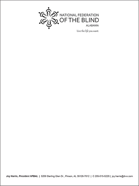
Applications: Stationery
When to use: Letterhead is to be used in formal correspondence, letters, etc., to external audiences.
A letterhead template Word file has been created for all state affiliates. Please contact Suzanne Shaffer Schildwachter at [email protected] or (410) 659-9314, extension 2264, if you require the template. Templates can be created for divisions and chapters as well; please contact Suzanne to request.
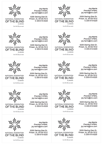
A 10-up business card template has also been created in Word for all state affiliates. The information on the card can be personalized for you, or if you are comfortable editing text boxes in Word you may. Any office supply store should have 10-up sheets that are perforated for printing business cards from your own printer. If you would like to have your cards printed with a local printing company, contact Suzanne for a 1-up card.
Letterhead
Business Cards 10-up
Applications: Marketing Materials
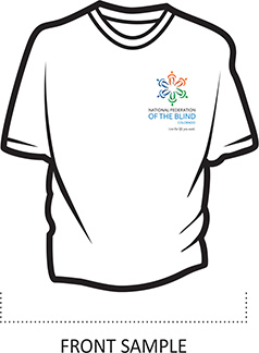
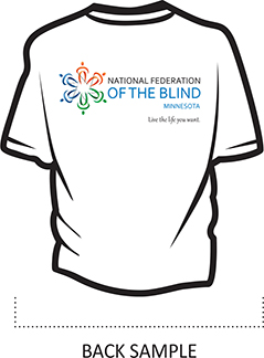
We want to present a unified brand when attending events such as Meet the Blind Month activities. To that end we have (in the past) printed table banners, podium stickers, and small NFB flags for all affiliates. Other options might be table-cloths or T-shirts with the national, state, or chapter logo on them (examples below). If you require logo files or help setting up files for your printer, please contact [email protected].
In order to ensure a unified brand, please also send any artwork you plan to have printed to [email protected] for approval.

Photography
Photos are an important part of our branding because they help tell our story. We want to show the general public that blind people can do all the things they can do and that we are active, interesting, and productive members of society.
When taking photos be sure that your camera is set to take the largest file size photo. This ensures the photo will be usable for both print and web. Low resolution files can only be used on the web or for social media. When taking photos of anyone (especially children) it is important to get a signed media release to avoid problems. Below is a sample media release.
If you do not have an aspiring photographer but find that you have a need for photos, we do have a library at the national center. Please contact the library at [email protected] or call (410) 659-9314, extension 2310 with specific requests.
Media Release
National Federation of the Blind Media Release and Permission
The NATIONAL FEDERATION OF THE BLIND often takes photographs and video of children and adults for educational and promotional purposes. These images may be used in printed materials, on our website, and in training and promotional videos. We may also send them to the news media.
I give permission to the NATIONAL FEDERATION OF THE BLIND and other NATIONAL FEDERATION OF THE BLIND event program partners to use my image or likeness, or the image or likeness of my participating minor child, in materials produced by the NATIONAL FEDERATION OF THE BLIND for promotional and educational purposes, or for any other purpose, and in any manner and medium.
__________________________________ __________________
SIGNATURE DATE